Clients:

lukeduff.co.uk

Category:

Bespoke Tool & Chrome Extension

Link:

See The Result

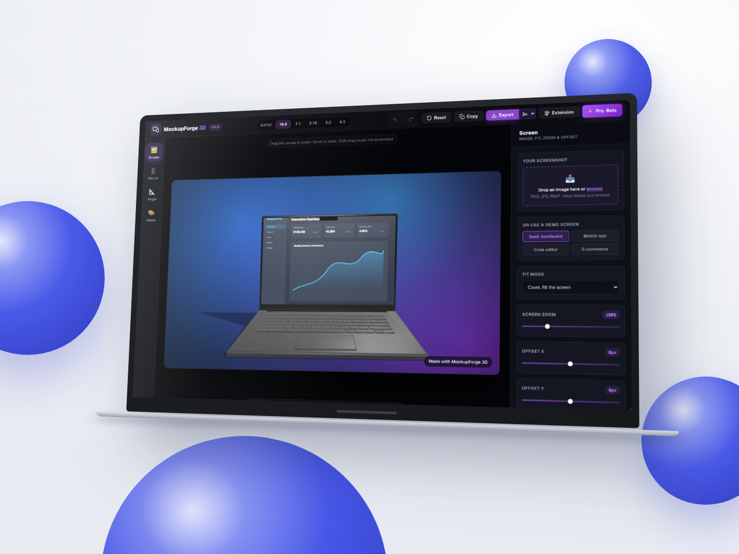
MockupForge 3D, browser-based 3D device mockup studio

Client: lukeduff.co.uk · Sector: Design tooling · Location: United Kingdom

1 | Brief

Designers, indie developers and agencies all need a clean product shot on a regular basis: for a landing page, an app store listing, a case study or a social post. The usual options are wrestling with a Figma template or paying a monthly subscription to a mockup service. MockupForge 3D is a third route. Drop in a screenshot and it renders onto a real 3D device model, iPhone, MacBook or iPad, with studio lighting, a mesh-gradient backdrop and an export up to 4x resolution, all without creating an account or uploading a file.

The key word is real. These are genuine three.js and WebGL renders using GLTF models, a physical-based lighting rig and a real camera, so orbit the device to any angle and the highlights, perspective and shadow all follow correctly. Two additional frames, a browser window and a glass card, render through a separate hand-built 2D canvas pipeline, because they are flat UI chrome rather than physical objects. Everything runs client-side. No file ever leaves the browser, there is no account, no cookie and no analytics, and the whole thing costs nothing to operate.

A companion Chrome extension, MockupForge Capture, removes the screenshot step entirely. It grabs the current tab and routes it straight into the studio with the render already set up. Capture Mobile goes further, re-rendering the page through a real emulated phone viewport at the correct device pixel ratio before handing it to the iPhone model.


2 | Key Goals

  • Render screenshots onto real 3D device models with correct lighting, perspective and shadow at any orbit angle, rather than pasting onto a flat template.
  • Keep everything client-side with no account, no upload, no cookie and no analytics — a file should never leave the browser.
  • Give full studio control across fourteen sliders covering yaw, pitch, scale, device colour, screen glare, shadow depth, grain, backdrop theme and blur, plus 1x, 2x and 4x export, clipboard copy and one-key social card generation.
  • Ship with no build step, no bundler and no npm dependencies whatsoever, so the project deploys as plain static files.
  • Compress the GLTF assets to a size usable over a normal connection without hard-coding anything about geometry scale or layout.
  • Meet WCAG 2.1 and 2.2 AA, proved by automated runs rather than assumed by eye.
  • Work correctly on desktop, tablet and phone from a 320px viewport up to 2560px, and across Chromium, WebKit and Firefox.

3 | Solution Snapshot

Problem Solution Implemented
Real-time WebGL normally drags in a bundler, a package.json and a CI build step before anything renders. Vendored three.js as static ES modules behind a native browser import map. No package.json, no node_modules, no CI build. Deploys as static files on Vercel, auto-deploying on push to main.
Dark metallic device bodies lit only by flat directional lights rendered as near-black silhouettes. Switched to a PMREM-baked room environment for image-based lighting. The lighting rig, key light distance, shadow camera frustum, shadow-catcher plane, is derived from the device's bounding sphere each frame, with a soft contact shadow stamped at the footprint.
The raw GLTF assets weighed 58MB because the geometry carries no textures and the weight is entirely f32 vertex data, making them impractical over a normal connection. Quantized and meshopt-compressed the assets down to 4.2MB, keeping a 1.5-million-vertex iPad model usable.
One asset shipped with non-linear screen UVs, three vertex columns covering 43%, 14% and 43% of the physical screen, which crushed a third of every screenshot into the middle of the display. The bug survived two wrong diagnoses because it was being tested with a square image, which cannot detect non-uniform distortion. Rebuilt the UVs from vertex positions at load time so the mapping is proportional by construction. Verified with a ruler image: the bar-gap ratio went from 1.66 to 1.000.
WCAG 2.2's 24px target-size rule fails a studio UI built from standard range inputs, and automated audits could only see the inspector pane open by default, leaving real defects unreachable. Rebuilt all fourteen range sliders and both on-canvas quick buttons to meet the target size. Made the screenshot pane the default inspector tab, which immediately surfaced three real defects the audits had never been able to reach. Zero axe-core violations remain across all pages, verified at four viewports.
A watermark rendered as a CSS overlay is a toggle anyone can inspect away, making a paid removal tier meaningless. Composited the watermark into the exported bitmap itself rather than layering it over the canvas, so removing it is a genuine product feature rather than a class you can delete in devtools.

4 | Impact

  • 739 automated checks run across five committed verification harnesses against the production site, covering accessibility, console errors, overflow, export, presets, shortcuts, undo/redo, responsive layout and extension handoff.
  • GLTF assets compressed from 58MB to 4.2MB, making a 1.5-million-vertex model workable over a standard connection.
  • Screen UV distortion fixed and measured: bar-gap ratio from 1.66 to 1.000, confirmed on a ruler image.
  • Zero axe-core violations across all pages, verified by automated runs at four viewports against WCAG 2.1 and 2.2 AA.
  • 577 responsive checks covering 8 pages across 13 viewports from 320px to 2560px, with the WebGL path verified on Chromium, WebKit and Firefox — all five devices rendering, zero console errors, valid export on each engine.
  • Costs $0 per month to operate because everything runs client-side and the site is deployed as static files.

What are you waiting waiting for?

Start Your Project Today
Book a FREE Call
footer shape