

Clients:

Concept work

Category:

Website Design

Two brands that don't exist. Two full builds that do.

Sometimes I design a complete site around an invented brand, because the best way to show what a niche could look like is to build it properly. No templates. Everything here is mine, from the name to the last hover state.

Both are concept builds: the businesses are fictional, the design is real, and every screen on this page is captured straight from the working build.

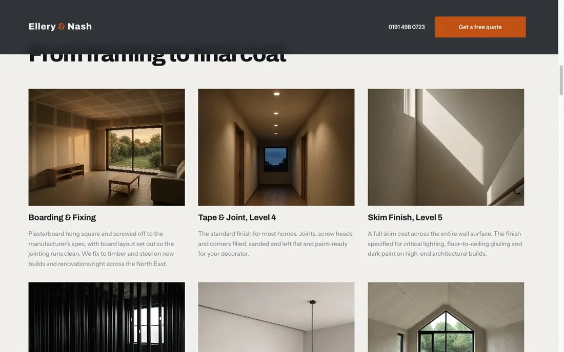
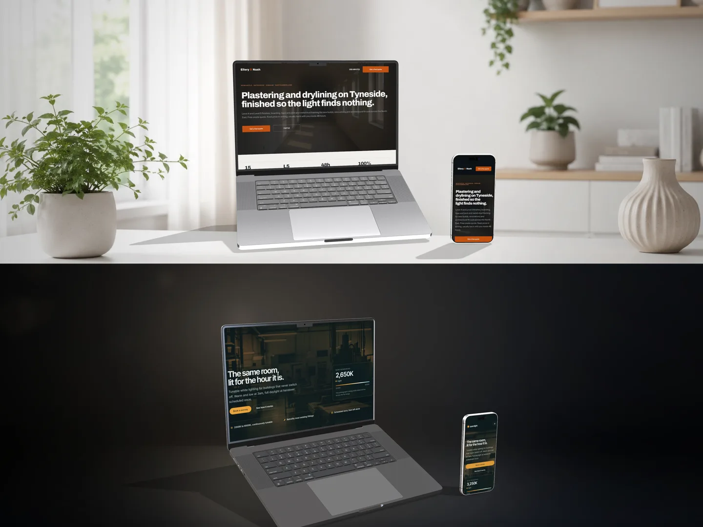
Ellery & Nash Plastering and drylining, single-page concept

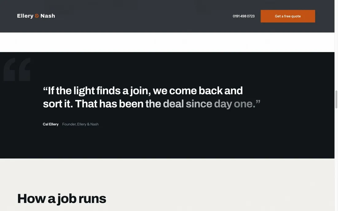
A trade site with the presentation language of an architecture studio. Editorial layout, hairline rules instead of boxed cards, and one idea carried through the whole page: light revealing workmanship.

Ellery and Nash concept homepage, full desktop page

The full page. Hover to walk through it, or scroll inside the frame on a phone.

Ellery and Nash concept homepage on mobile

375px, same system: swipe carousel for services, uniform buttons.
The design system

#0C1116
#F2F1ED
#C2500F
#E5804A
#6B7480
Aa
Archivo 800 for headlines, Instrument Sans for body. Ink on paper, rust for the moments that matter.

The moves

  • Hairline rules, not cardsSections are separated by 1px lines and space, the way a printed spec sheet does it.
  • One photo gradeEvery photograph sits at 32% desaturation until you touch it. The page feels graded, like a film.
  • A motion layer with mannersMasked headline reveals, self-drawing rules, a scroll-scrubbed founder statement. All of it honours reduced-motion settings.

"Plastering and drylining on Tyneside, finished so the light finds nothing."

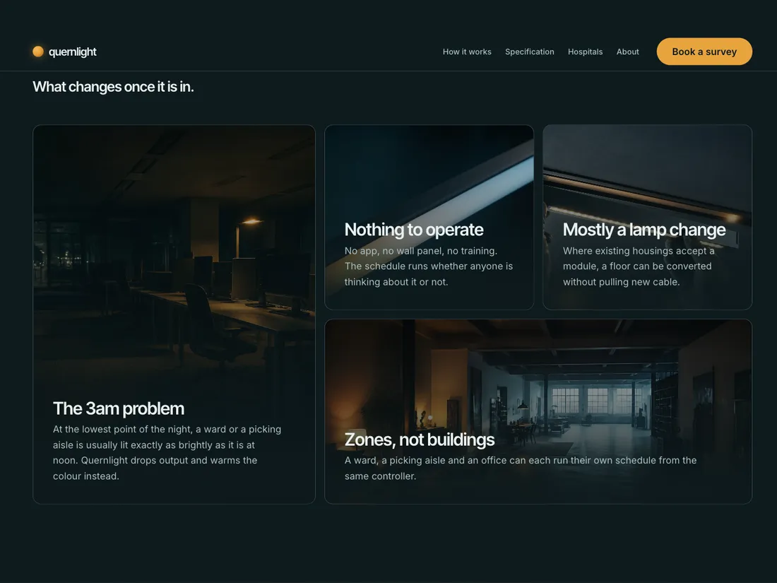
Quernlight Tunable lighting for buildings that run through the night, 11-page concept

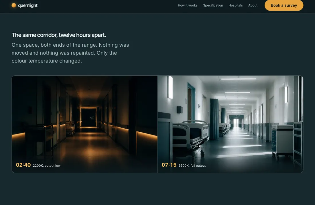
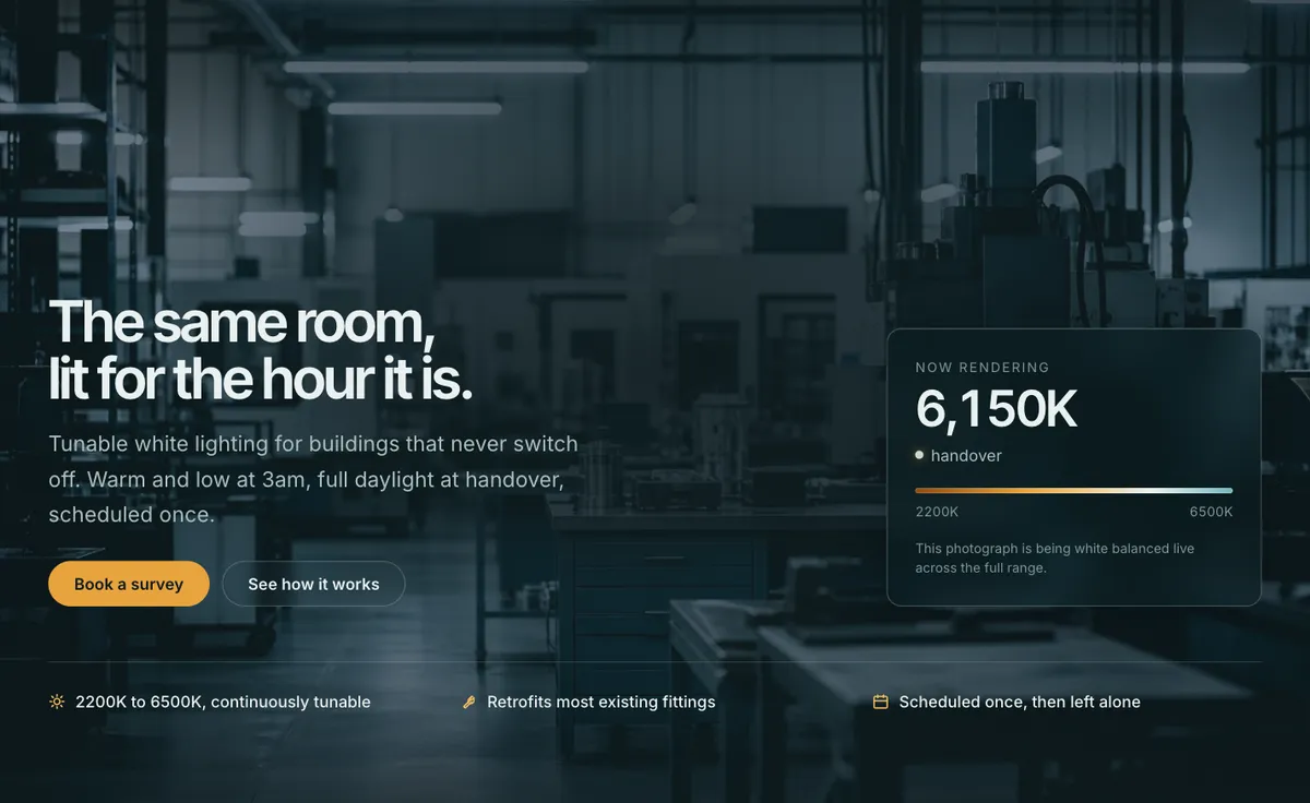
The interface behaves like the product. On the live build, the hero photograph is white-balanced in real time across the full 2200K to 6500K range, so the proposition lands before a single line of copy is read.
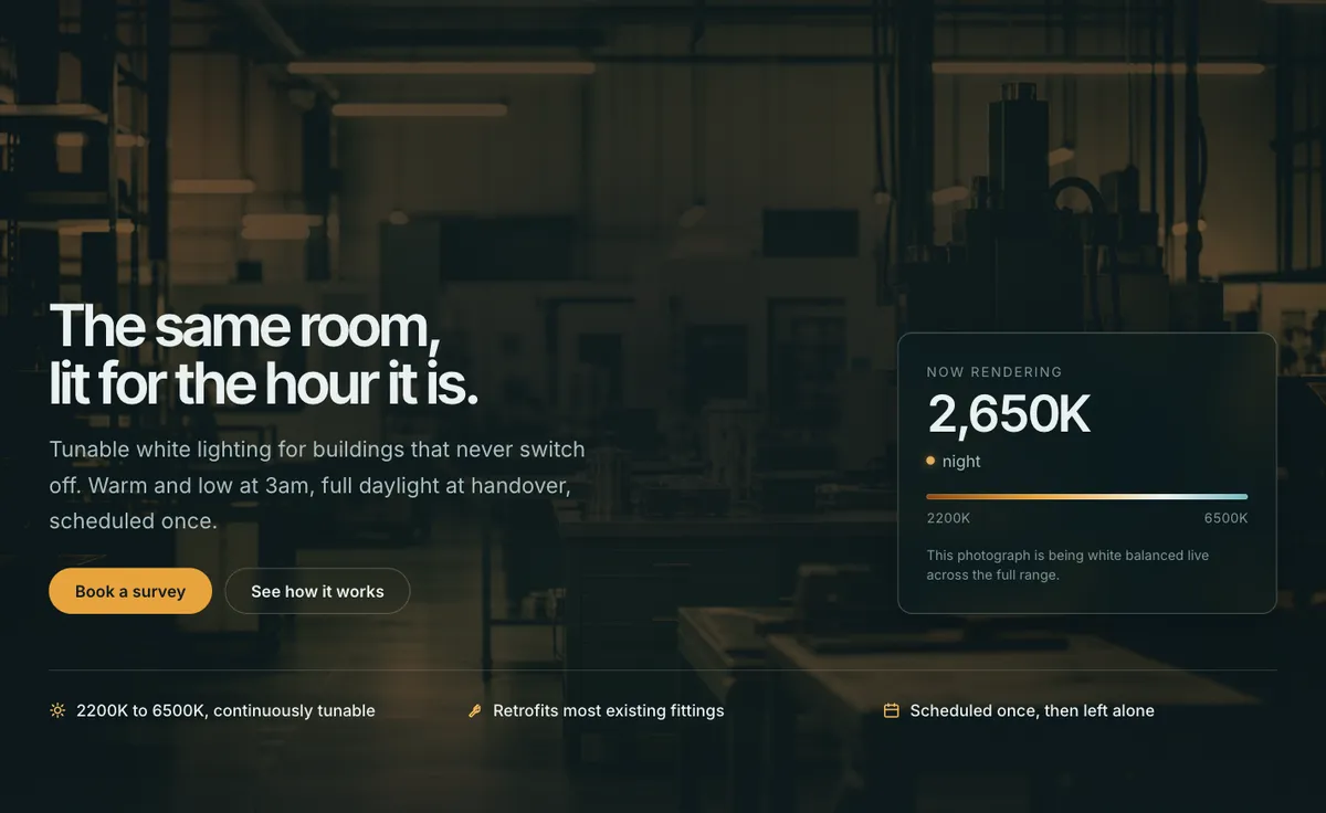
Quernlight hero graded warm at 2200 kelvin
Quernlight hero graded cool at 6500 kelvin
2,200K, night6,500K, full daylight

Drag the line. Same photograph, both ends of the range the product runs.

The design system

#0e1a1d
#17292f
#1f363e
#e8a33d
#6fb7c4
Aa
Inter Tight and Inter, self-hosted at 91KB. A locked dark theme where amber is the light source, not a decoration.
Quernlight concept homepage, full desktop page

Home, the showpiece page. Hover to walk through it.

Quernlight concept homepage on mobile

Same hero, same readout, 390px.

The moves

  • The demo is the pitchA live WebGL white-balance on the hero, with a readout showing the exact kelvin value being rendered.
  • No scroll listeners anywhereEvery animation is gated behind reduced-motion preferences and driven without a single scroll event.
  • Light as hierarchyPanels are lit from above by a 1px amber edge. The brightest thing on any screen is the thing that matters.

"A building lit at one colour all night is lit wrong twice."

Both builds use fictional brands, drama-reserved phone numbers and concept imagery. Nothing on them belongs to a real business, and neither carries a single invented review.

Live demos of both concepts are on the way.

What are you waiting waiting for?

Start Your Project Today
Book a FREE Call
footer shape