

Clients:

Concept work

Category:

Website Design

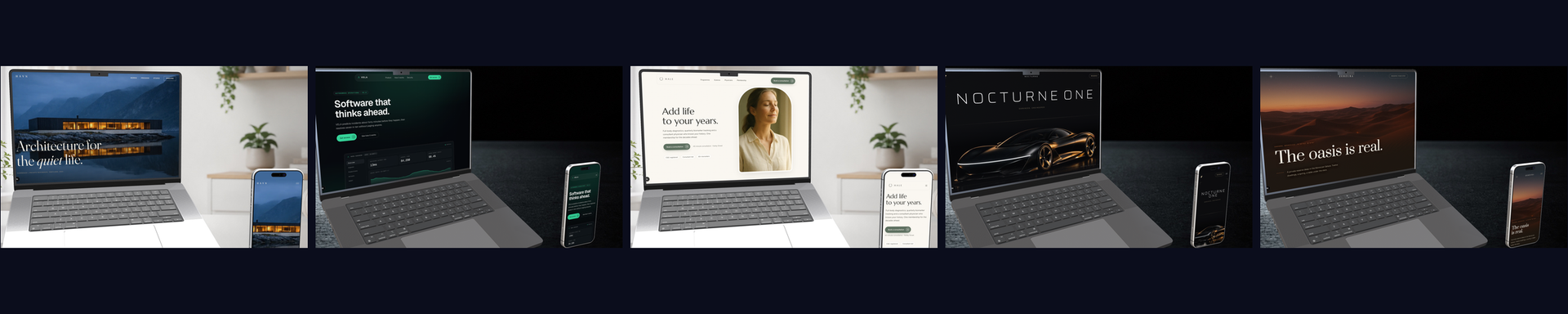
Five brands that don't exist. Five complete builds that do.

Every so often I build a whole site around an invented brand, because the fastest way to show what a niche could look like is to design it properly rather than describe it. These five were built in one run, deliberately sharing nothing: no repeated font, no repeated accent colour, no repeated layout, no repeated hero.

All five are concept builds. The businesses, the people, the credentials, the press names, the quotes and the prices are invented for a design portfolio and describe no real company or person. The design is real, and every screen below is captured straight from the working build.

Jump to a concept Or hover any browser frame to watch that site scroll from top to bottom.
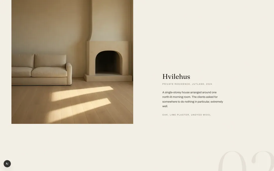
HAVN Architecture and interiors atelier, single-page concept

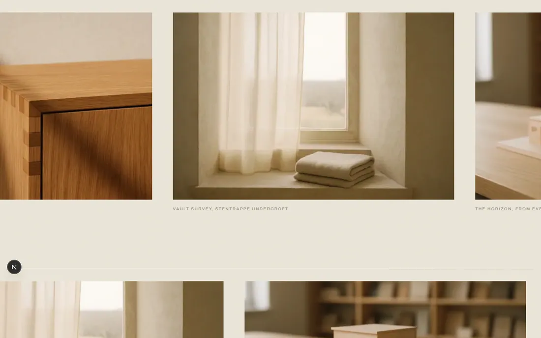
A studio site built like a printed monograph rather than a website. Massive serif headlines, museum captions, asymmetric plates, and no shadow anywhere: depth comes from imagery and overlap. The whole page runs on one accent colour used barely a handful of times, because restraint is the thing being sold.

  • Built forPrivate clients and boutique hotel developers
  • DemonstratesEditorial luxury, typographic restraint
  • TypeFraunces and Archivo
HAVN concept site, the full desktop page from top to bottom Hover to playScroll insidethe whole page

The entire page, captured a screen at a time while scrolling, so the pinned horizontal gallery appears as it actually plays.

HAVN concept site on mobile

390px. Scroll inside it. The horizontal gallery drops its pin and becomes a snap-scroll.
The design system

#F4F0E6
#E5DECF
#181511
#A8552F
#8A8577
Aa
Fraunces 300 for display, Archivo for captions and labels. Ink on bone, clay reserved for about five moments on the whole page.

The moves

  • Whitespace as the luxury signalSections breathe at a scale most trade sites never allow. The restraint is the argument: a studio that takes six commissions a year should not look busy.
  • Museum captions, not marketing labelsEvery image carries a tiny tracked caption naming the project, type and year. It borrows the grammar of a gallery wall.
  • One accent, rationedClay appears on a single italic word, a hover fill and a rule. Give it a sixth use and the whole system loses its nerve.

"We design very few buildings, and we design them slowly."

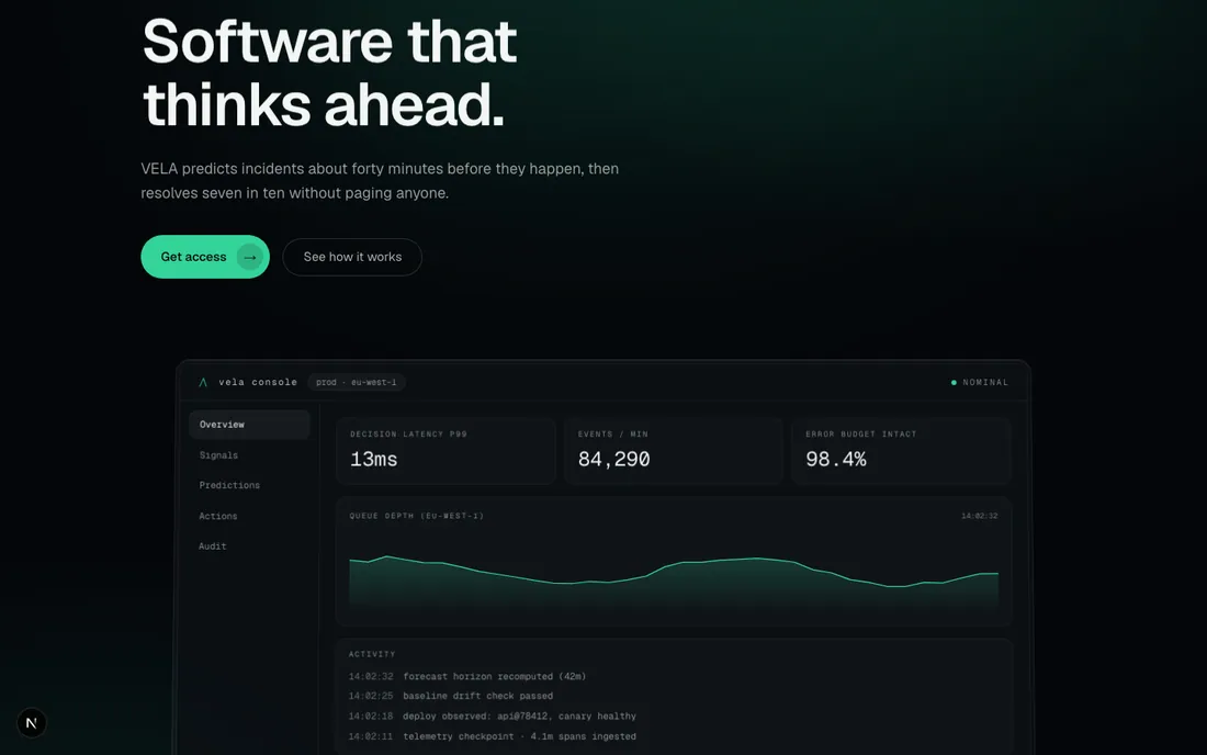
VELA AI operations platform, product marketing concept

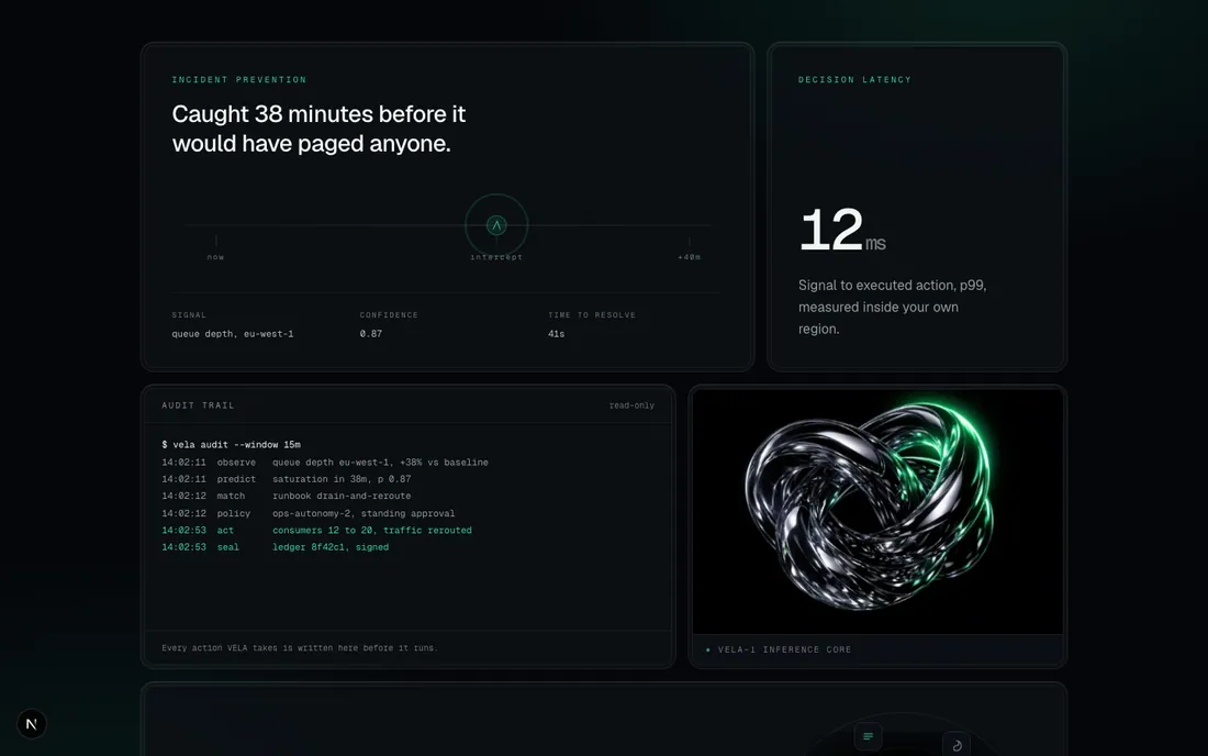
The centrepiece is a product console that is not a screenshot. It is hand-built in React and it runs: metrics tick, an incident appears, the platform intercepts it. Everything around it is glass on OLED black, with a monospace voice for anything that behaves like data.

  • Built forCTOs, platform and SRE leads
  • DemonstratesProduct design, glass UI, live data
  • TypeGeist and Geist Mono
VELA concept site, the full desktop page from top to bottom Hover to playScroll insidethe whole page

The pinned three-step story is captured at each of its settled states, which is how it reads when you scrub it live.

VELA concept site on mobile

390px. The console keeps running; the bento unstacks to a single column.
The design system

#04060A
#0B0F14
#34D399
#0E3B2E
#F2F5F4
Aa
Geist for everything spoken, Geist Mono for everything measured. Emerald is a signal colour, so it only ever marks state.

The moves

  • Show the product workingA static dashboard screenshot asks for trust. One that runs a scripted incident in front of you earns it, and it stays razor sharp at any zoom because it is markup.
  • Mono for anything measuredNumbers, labels, log lines and timestamps all sit in Geist Mono. The typographic split does the job a legend would otherwise have to.
  • Glass with a lit edgeEvery panel is a translucent surface over a ring, with a one pixel highlight along the top. It gives depth on pure black without a single drop shadow.

"Boring by design."

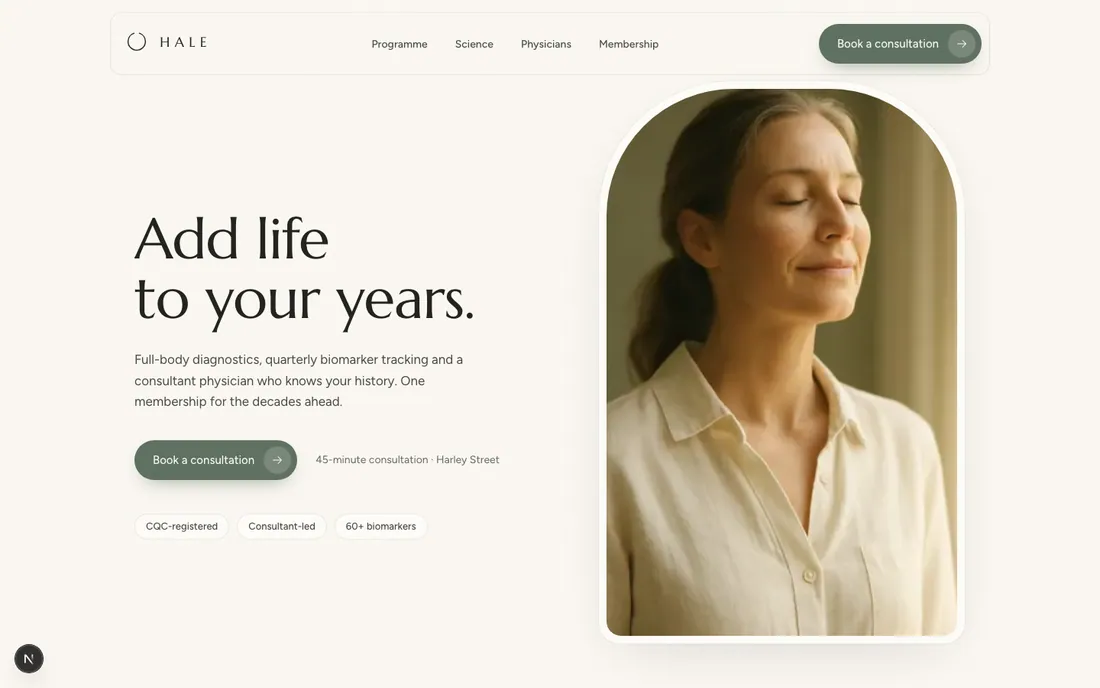
HALE Private longevity clinic, conversion-focused concept

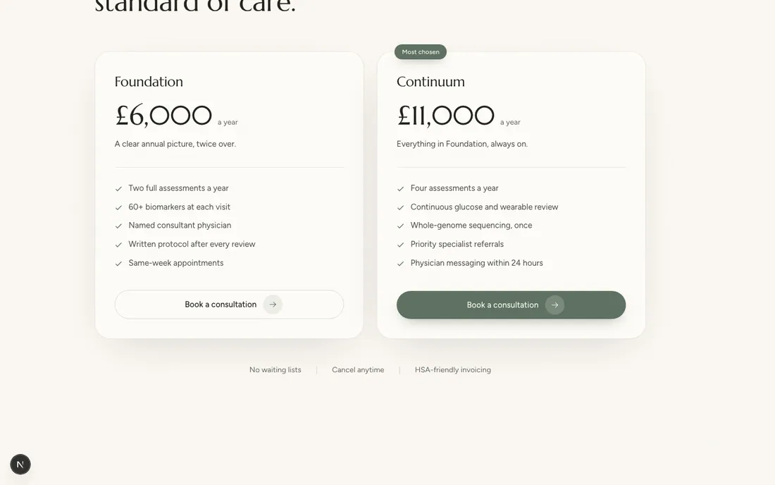
This one is built to convert rather than to impress. Every scroll beat either builds trust or removes friction, and the same call to action repeats in the same words five times down the page. The surfaces are soft: generous corners, warm light, and shadows so diffused they read as air rather than elevation.

  • Built forTime-poor, data-driven, cautious buyers
  • DemonstratesTrust design and conversion
  • TypeMarcellus and Figtree
HALE concept site, the full desktop page from top to bottom Hover to playScroll insidethe whole page

Watch the same call to action come back in the nav, after the story, after the science, after pricing and at the close.

HALE concept site on mobile

390px. The arch survives, the two pricing tiers stack, the CTA stays put.
The design system

#FBF8F2
#F1EBE0
#23241F
#5F7161
#B79A6B
Aa
Marcellus for display and Figtree for body. One display weight only, so the hierarchy has to come from scale rather than boldness.

The moves

  • One call to action, repeated word for wordFive appearances, identical wording every time. Varying the phrasing feels writerly and quietly asks the reader to re-decide at each one.
  • Evidence before the askCredentials, named physicians, a scrubbed chart and the process arrive before pricing, so the number lands on a reader who already believes the story.
  • Calm motionReveals are slow fade-ups with a touch of blur, over a second long. Snappy easing reads as energetic, and energetic is wrong for a clinic.

"Add life to your years."

Nocturne Electric hypercar marque, cinematic launch concept

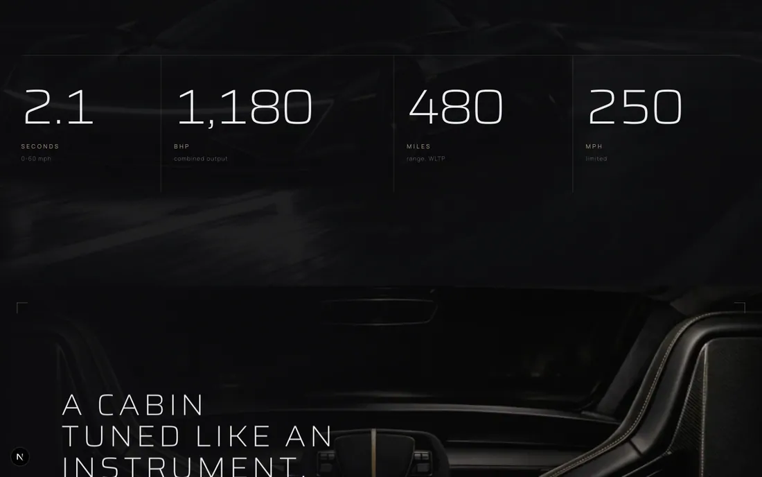
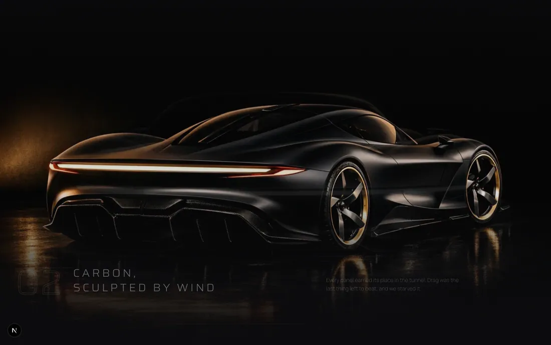
The page is a night-drive film you scrub with your thumb. Full-screen chapters, title cards between them, and a pinned sequence that cross-fades the car through three angles as you scroll. Monochrome with a single champagne accent, no glass and no blur anywhere: this is lacquer, not interface.

  • Built forCollectors buying with their heart
  • DemonstratesMotion design, scroll choreography
  • TypeSaira and Manrope
Nocturne concept site, the full desktop page from top to bottom Hover to playScroll insidethe whole page

The three-angle sequence is a single pinned section. It appears here as three frames because that is exactly how it plays.

Nocturne concept site on mobile

390px. The spec numerals stay enormous, because shrinking them would lose the point.
The design system

#08080A
#131318
#D5C5A1
#8C6A3F
#EDEDEF
Aa
Saira at its lightest weights and very wide tracking, with Manrope kept small and quiet underneath. Monochrome and champagne, no third hue.

The moves

  • Tracking as an animationThe hero headline tightens from wide to close as the darkness lifts off the car. Letter-spacing is doing the work a zoom usually does.
  • Title cards between chaptersThree short lines on black, alone, with nothing else on screen. They pace the page the way cuts pace a car commercial.
  • Renders that dissolve into the pageEvery image is edge-feathered onto pure black, so a shot ends in shadow rather than on a visible rectangle.

"No engine. No noise. No equal."

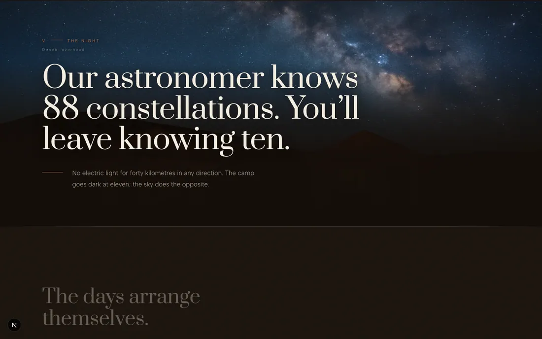
Zerzura Private desert reserve, immersive storytelling concept

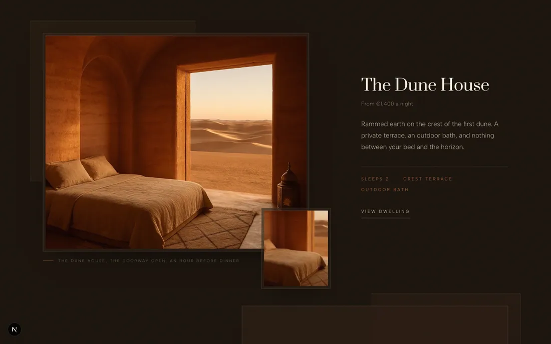
Structured as chapters, so you travel there by scrolling: myth, arrival, dwellings, the table, the night, then the booking. It is the slowest-paced of the five on purpose. The palette is firelit umber rather than black, because a desert at night is warm and a black page would have made it cold.

  • Built forHoneymooners and sabbatical takers
  • DemonstratesImmersive storytelling, booking flow
  • TypePrata and Albert Sans
Zerzura concept site, the full desktop page from top to bottom Hover to playScroll insidethe whole page

Watch the light change as you go down: dusk, then interiors, then full night, then the booking block.

Zerzura concept site on mobile

390px. The chapter rhythm survives the narrower column intact.
The design system

#1A120B
#2B1D12
#C06E3F
#9A6A5C
#E8D9BD
Aa
Prata, a high-contrast didone used large and never bold, over Albert Sans at 300 with airy line height. Terracotta carries the labels.

The moves

  • Pacing as a design decisionThe slowest scroll of the five, tuned deliberately. A place selling the absence of hurry cannot have a page that rushes.
  • Warm dark, not blackThe base is umber. It keeps firelight and sand in the same family, where a neutral black would have fought both.
  • Imagery as the architectureFull-bleed photographs are the structure, with serif overlays on top. There is barely a card on the page.

"Our astronomer knows 88 constellations. You'll leave knowing ten."

Five brands, five design languages, five different arguments about what a website is for. That is the point of building them: a portfolio of one look only proves you have one look.

Every brand here is fictional. The people, credentials, press names, quotes and prices are invented for a design portfolio and describe no real company, product or person. Nothing on this page reports a result, because nothing here has shipped to a customer.

What are you waiting waiting for?

Start Your Project Today
Book a FREE Call
footer shape